Christian Web Development Case Study
INTRODUCTION:
This is the 1st of several case study publications in an astonishing 7-year digital marketing case study. This 7-year study is a combination of data from several different businesses within different niches. However, the same strategy was used in each study, with the end result of each being nothing short of remarkable.
Just as a reminder, the overall focus of this study (laid out in multiple articles) is to show you how to maximize leads and revenue through your business, church or organization’s website.
Inasmuch, the reason this case study will be laid out in several different articles is because there are several different mechanisms to this digital marketing system.
Just as we each have one body, we also have several different working parts that make up our bodies; the head, arms, legs, feet and so-on. And if you read the introduction to this case study, you will remember that I revealed my #1 secret to digital marketing – which is practicing the “inside-out” approach, and initially focusing on Website Development, before ever spending a dime on 3rd-party platform ads or SEO services.
Therefore, when it comes to this case study, consider that the body is actually Website Development, and the different mechanisms will include:
- Website Design & Optimization
- Search Engine Optimization (SEO)
- Lead Generation
- Email Automation, Segmentation & Marketing
- Video Creation & YouTube
- Google Ads
- Facebook Ads
Web Design vs. Web Optimization
Whether you’re a business owner, a pastor of a church, or a leader of a non-profit, at some point you were told, “You have got to get a website if you want to grow and compete.”
Therefore, you either:
- Spent the next 6 months piecing together a DIY website
- Hired a friend of a friend to throw a site together for you real quick
- Or you may have even spent a good chunk of money on a very beautiful website
Then you waited. And waited. And even waited some more. But nothing really happened, did it? It wasn’t anything like you had imagined. You didn’t start making a ton of sales, generating a ton of leads, or getting a ton of phone calls through your new website.
The truth is, whether you threw together a DIY website, or paid big bucks for a beautifully designed website, the results wouldn’t have been much different. Why? Because there is an exponential difference between Web Design and Web Optimization.
“There is an incredible difference between building a website to get compliments and building a website to get conversions.”
For example, I had a business reach out to me in October of 2020, asking if I could perform search engine optimization on their website. They had a decent looking website, and had done well over the years with a number of good blog posts.
So after performing a quick site audit, I called them back and asked:
“What is the most you’ve ever done in sales during a Christmas season?”
CLIENT: “About $111,000.”
I replied, “Mr. Client, if we could double that $111,000 this season, would you have the product and manpower to be able to take on that much business?”
After he chuckled, I let him know that I was extremely serious, and I would not make the changes I wanted to make to the website if he could not handle it.
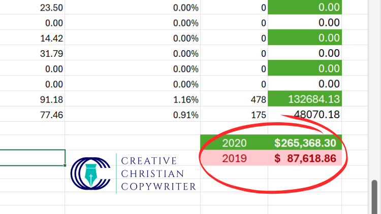
Now, you can see in the image below, during the previous Christmas season of (2019) my client had earned almost $88K. You can also see that we not only more than doubled their previous sales record, but we almost tripled their sales from the previous year as well.

What it Means to “Optimize”
So how did we more than double my client’s previous sales record? Optimization!
When most website owners think of optimization, they are usually concentrating solely on search engine optimization. However, true website optimization is the sum of all optimization techniques that totally encompass a superior user experience, by:
- First attracting the customer who is seeking your exact product, services, organization or church
- Allowing the customer to find exactly what they’re looking for on your website as quickly as possible (the fewer the clicks, the greater the conversion rate)
- Providing enough good content on your website that answers questions the user has; allowing them to make an educated decision
- Providing the user with an obvious and easy path to make their purchase or contact you in a variety of different ways (phone, email or filling out a form)
Yes, when I helped to more than double my client’s sales that Christmas season, I most definitely implemented a lot of good SEO content on their website. However, when I called him back after performing a website audit, it wasn’t the SEO I was excited about. Yes, the SEO helped in our cause. But in no way was it the SEO that more than doubled his sales.
One of the first things I noticed was that he had a really frustrating navigation issue on his site. It was difficult for me to get to the products I was trying to get to, and oftentimes it would simply loop me right back to the Homepage. I immediately was taken back at this. Why?
My website audit showed:
- More than half of my client’s products were not even showing up on Google Search
- The bounce rate on certain pages of the site was very high, leading me to understand that due to the navigational issues, most visitors couldn’t get to where they wanted to go, and finally gave up and left the site
Most importantly, my client was just a few weeks away from having a few dozen website visitors per day, to having a few thousand website visitors per day. Therefore, I had to call him to confirm he had the manpower and enough product on hand. And thank goodness he did. Because by the Grace of God, he was showered with sales that Christmas season.
Choose Web Optimization Over Design

The #1 rule to increasing website conversions, my friend, is to get the user where they want to go as quickly as possible. Period. Which is to say,
“The fewer times you make a website visitor click to get to where they want to go, the greater the chance of a website conversion – whether that conversion is a purchase, a phone call or a form lead.”
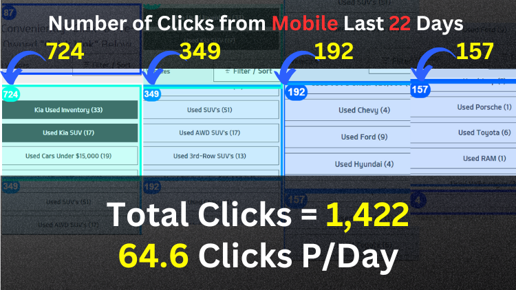
I’ve helped several clients in the automotive industry. On one of my client’s websites I placed several buttons atop a specific used car page (as shown in the above image). Each button link went to a specific “Make.” I had a button for:
- Used Chevy Models
- Used Ford Models
- Used Hyundai Models
- Used SUV’s
.. etc., etc. Not only so, but I also put the number on the button of how many we had of each make.
My client didn’t like it. He thought it looked tacky. But then I explained to him the #1 rule to increasing website conversions, and I showed him my analytics where in the previous 22 days, nearly 1,500 people had clicked those buttons on their mobile devices.
Most importantly,
“I convinced my client that sometimes you have to choose Optimization over Design; choose to sacrifice the look for the lead.”
For those 1,422 website visitors, I provided an excellent user experience, allowing them to get to where they wanted to go as quickly as possible, and without having to filter through all kinds of junk one usually encounters when on a dealership’s website.
Below you will find another quick example.
Begin with a Website Blueprint
In a previous web design series, I wrote extensively on designing a website blueprint before actually ever beginning to build your website. I also explain the process in-depth in my SEO book for Christian business owners.
What do I mean by Website Blueprint? I’m referring to your website’s navigation. However, it doesn’t only pertain to your website’s “Main Navigation.” It pertains to the overall navigability of your website.
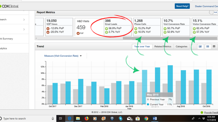
For example, in the below image, I want you to focus on the numbers in the two top-right blocks:
- Visit Conversion Rate – up 52.9% YOY
- Visitor Conversion Rate – up 57.3% YOY
Those two lead rate increases represent the YOY increase during the months of May – October 2018.
And, of course, I began working my magic on the website in April, right before the huge spike you see that began in May.

Check out the awesome details surrounding this project:
- New Car dealer with two car lots (Chrysler, Dodge, Jeep, RAM and Chevrolet, Buick, GMC)
- 3 different websites (one for his CDJR lot, one for his Chevy, Buick, GMC lot, and one website containing all inventory from all 7 brands)
- Dealership Owner’s Goals: Implement SEO on the CDJR and Chevy, Buick, GMC Websites… and delete the 3rd website with all 7 brands.
All was moving along fine as I began my website audits and research. But during my research… I spotted something of great importance.
Remember, my client was wanting me to delete the website containing all 7 car brands. However, during my research, I discovered that in most cases when someone was searching online for my client’s business, Google most always only showed the website with the 7 car brands. Wow! What a huge mistake it would have been to delete that site. And sadly, most companies out there would have simply deleted the website, because most companies don’t do the research.
So What Caused the Huge Website Conversion Increase:
Once again, everyone thinks, “SEO, SEO, SEO.” And yes, implementing SEO helped in this project. However, it wasn’t the main cause of the huge conversion spike.
Just as I had done with my previously mentioned client at Christmas time, I went to work on this client’s website navigability. And please listen closely to what I’m about to tell you.
Those YOY website conversion increases of over 50% literally contributed to hundreds of thousands of dollars in additional sales and revenue for this dealership owner. And would you like to know what I did to cause that increase?
ANSWER: I simply took 10 minutes to add 7 buttons at the top of the homepage on the 7-brand website. That’s it! I added a button for:
- Chrysler inventory
- Dodge inventory
- Jeep inventory
- RAM inventory
- Chevrolet inventory
- Buick inventory
- GMC inventory
Therefore, when customers landed on the website, instead of having to click 10-20 times through all kinds of filters, they could make one little “click” and view all the available inventory of their desired manufacturer.
Conclusion
Right now you might be thinking,
“Oh great, I was hoping SEO was going to solve my problem, but now I have to learn all this stuff about website optimization as well..”
From the bottom of my heart, I want to encourage you to most definitely put off that thinking, and to truly see the value this article brings.
My 3 main goals in sharing this priceless case study with you was to:
- Help prove to you my theory that the #1 secret to what we call “Digital Marketing” is not ad clicks from social media and other 3rd-party platforms (the outside-in approach), but it is in fact the inside-out approach beginning with Website Development.
- Show you the incredible value of choosing Website Optimization over Website Design.
- Save you hundreds, if not thousands of dollars on driving traffic to your website, if your website is not optimized to convert the traffic into leads and sales.
If you have found value in this case study article, please feel free to:
- Leave a comment at the bottom of this page as to how this article helped (or whatever your opinion might be)
- Sign up in the form below to receive a notification when I publish a new case study in this series (the next case study will be on (SEO) Search Engine Optimization)
- Scroll down and schedule a quick consultation. You would be amazed at how many problems you can solve with a quick phone or zoom call. I’ve save clients countless hours of wasted time trying to figure out how to do “this-or-that.”


